When you include Data Labels on your visualizations, Pyramid uses the Position and Label Optimization settings, and the available space on the canvas, to decide which data labels to include and where to place them on the diagram. This topic provides an example that should help you to optimize your visualizations.
The basic rules of the Data Label optimization are as follows:
- Data Labels are shown when the option is selected in the Component ribbon or Formatting panel, and where there is available space for the labels to appear on the visualization.
- The Position option indicates where Data Labels should be placed relative to the "sections" (bars, columns, segments, and so on) on the diagram.
- The Label Optimization options allow Pyramid to include more or fewer labels on the visualization depending on your overlap tolerance and layout choices.
Segment Chart Example
This example shows how the Data Labels on a Segment Chart (a pie chart, in this case) are re-positioned in response to changes to the Data Label settings in the Formatting Panel.
By default, the Data Label Position is Optimized, so Pyramid places the Labels:
- Inside any segment (pie slice) where there is available space for the label (gray).
- Outside any segment where it cannot fit inside and where the label is readable and does not overlap with another label.
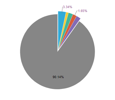
Note: Although our visualization includes six slices in total, we only see three data labels with the default settings. This is because only three data labels can be accommodated without becoming unreadable.
Tip: If your Data Label represents a custom measure (it is a measure that has been added to the Labels drop zone), you could add the same measure to the Tooltip drop zone. This allows your end users to view the measure represented by each data label in a tooltip, even if it is not shown on the canvas.
Allow overlapping labels
We can increase the number of labels shown by allowing the labels to overlap (Allow Labels Overlap) as follows:
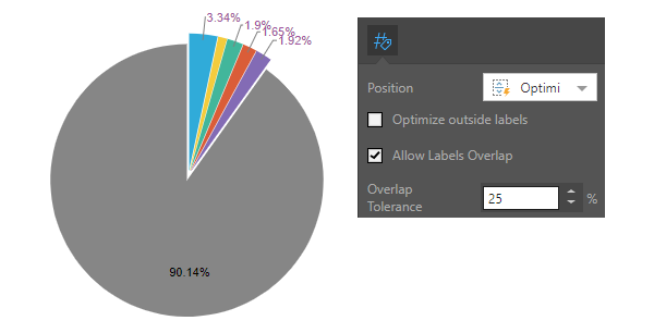
Note: The selections in the Formatting panel allow Labels to be shown if they have an overlap of 25% or less with another label. In this case, that allows five of the six labels to be shown.
We can increase the number of labels shown by increasing the Overlap Tolerance:
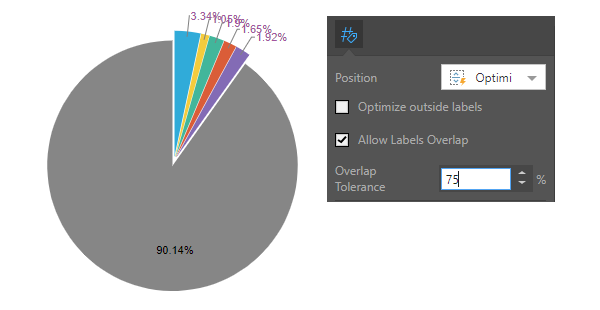
Be careful! Because the labels overlap to such an extent, they are difficult to read.
Optimize "outside" labels
Since some labels are outside of the segments, we can take an alternative approach to their layout!
We can use the Optimize Outside Labels checkbox to let Pyramid reposition the labels that are outside of the visualization segments. This option tries to show the maximum number of "outside" labels on the visualization, without the visualization becoming impossible to read. In this case, the optimization option ensures all labels are shown.
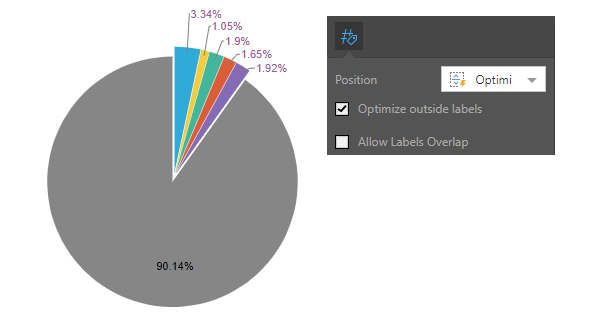
Note: This option can be used for data labels that are shown outside of the sections, when the selected Position is either Optimized or Outside.